TACTIQ

Controllers haven't changed much since the '90s. I designed one that adapts to how you play: tactile, modular, and built to evolve with your skills.
MY Role
Product Designer
Duration
11 Weeks, Autumn 2024
TEAM
Khadija Dial
Elisha Jeon
Addison Mercado
METHODS
User research
Physical prototyping
Usability testing
Figma
affiliations
UW Information School
INFO 463 Input Interaction
Professor Deb Cargile


CONCEPT 1 – ABANDONED
Morse Code Button
Single input via short + long presses. Maps to any key. Genuinely accessible for motor-impaired players.
Limitation: restricts gameplay to basic mechanics. Doesn't scale.
CONCEPT 2 – PURSUED
Tactile Cube
Each face of the cube supports a different input type. Modular panels snap in and out. Haptics, swipe, buttons, lever — all in one object.
Scales from simple to complex. Tactile and adaptive by design.
EARLY SKETCH
THE CUBE CONCEPT TAKES SHAPE

Early sketch: "swiping side / twisting + pulling side / poking + tap side / free side" — four distinct interaction modalities mapped to four faces of a cube. This sketch was the thesis statement for everything that followed.
BEFORE THE CUBE
MORSE CODE BUTTON EXPLORATIONS


Morse code controller sketches: hardware unit (left) + screen mapping UI (right). Clear logic, clean concept — but the single-input ceiling made us pivot.
03 — THE DESIGN
Six faces. One object. Infinite configurations.
TACTIQ is a cube where each face serves a distinct input function. Panels are magnetic and hot-swappable: pull one off, snap in another! The system is designed so a player can start with a simple button layout and gradually introduce gesture and haptic panels as their skills grow.
HOW IT WORKS
Tactile cube design walkthrough – connect & play


Tactile cube control panels in use – swipe & lever

By swiping left, right, up, or down, on the panel, the character will simultaneously move accordingly.

Pushing down on the lever will trigger the character to dodge enemies and obstacles or attack depending on the selected game.

Lifting the lever triggers a jump, and it can be combined with the swipe panels. For example, lifting the lever while swiping right makes the character jump diagonally to the right.

Slight pressure on the haptic panel triggers enhanced actions. Combining both panels simultaneously unlocks compound actions like "super jump", adding layered control and more dynamic gameplay.
PANEL SYSTEM – MID-FIDELITY


Haptic
provides tactile feedback to enhance immersion and confirm actions. Players can use pressure or multiple fingers to trigger different in-game actions.
Movement
Enables directional input through swiping gestures for fluid control. This led panel can additionally serves as a engaging 8-bit display, showing short animations when the cube is in idle mode.
Buttons
KEY DESIGN PRINCIPAL
The bottom panel was left intentionally blank as it's how the cube rests, charges, and powers on/off. The front panel displays the TACTIQ name.
FINAL PROTOTYPE RENDERS


BRANDING –– LOGO VARIANTS


Bold sans-serif with azure accent aligns with the playful-but-technical brand tone.
04 - PHYSICAL PROTOTYPE
Paper, glue, tape, and keyboard switches.
A Figma prototype can't tell you how something feels in your hands. So we roughly built one with paper, glue, tape, and salvaged keyboard switches as stand-in haptic buttons. The goal wasn't high functional fidelity, but rather getting out users to actually hold and play with it.
Since the prototype was non-functional, we used the Wizard of Oz method during user testing: I observed participants' physical inputs and manually translated them into a real controller to simulate gameplay. Each participant played a 2D platformer game with both TACTIQ and an Xbox controller, then gave us feedback.


05 – USABILITY TESTING
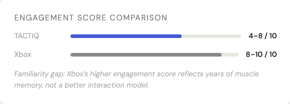
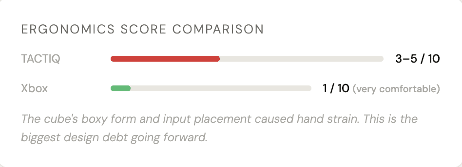
The data said: engaging but uncomfortable.
We tested TACTIQ against an Xbox controller across three metrics: level of difficulty, engagement & immersion, and qualitative comfort feedback, with participants ages 19–21 ranging from no gaming experience to seasoned players.
Participants used the physical prototype while I manually translated their inputs to an Xbox controller hidden from their field of view to simulate live gameplay. This was super challenging to pull off, but it gave us real data on grip, reach, and intuition.
The results were honest. TACTIQ won on novelty & engagement but lost on ergonomics. That tension was the most useful thing we discovered.
WHAT LANDED
-> Unique design sparked genuine curiosity. We found that out participants wanted to keep exploring it
-> Button clicks felt satisfying and responsive
-> Modular concept showed real promise. Several participants asked about customization
-> The gesture-based movement panel was intuitive faster than expected
WHAT NEEDS WORK
-> Ergonomics: beveled edges and more natural grip required
-> Input placement: some controls felt out of reach mid-game
-> A participant suggested a diamond-shaped panel layout for thumbs
-> Familiarity gap is real!!! TACTIQ needs an onboarding curve the Xbox doesn't
06 – REFLECTION
Innovation and practicality are both real constraints.
TACTIQ pushed me into territory I hadn't designed for before: hardware. Especially with hardware centered technology, you can't just push an update to fix a grip issue. Every decision about form, weight, and panel placement had downstream effects on how the thing actually felt in someone's hands during stress.
The usability testing taught me something I couldn't have learned in Figma: exciting ideas struggle when they meet real user needs. That's not a failure, that's the point of testing early and physically.
WHAT WORKED
-> Killing the Morse Code concept before investing too deeply — recognizing the ceiling early
-> Building a physical prototype and testing it in-person rather than just digitally
-> The modular panel system — the concept itself holds up and testers responded to it
WHAT I'D CHANGE
-> Test with a wider age and ability range; our 19–21 pool was too narrow
-> The digital UI needed more attention. An app companion for panel configuration could've been further explored
-> A working prototype, even partially, would have transformed the quality of testing feedback
4A56FF